If you're a new user of AppGini, feel free to ask general usage questions, or look for answers here.
-
DevGiu
- AppGini Super Hero

- Posts: 151
- Joined: 2016-05-27 09:08
Post
by DevGiu » 2016-09-12 16:30
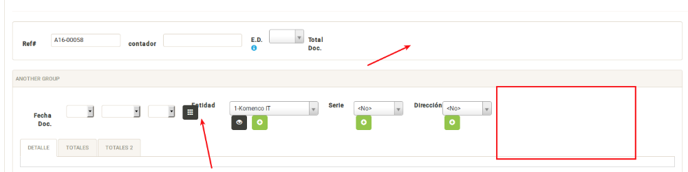
Some CSS/Bootstrap guru here, knows why If I set a fieldset to form-inline, all fields "stacks" to the left, and I get all of this blank space to the right?
I'm trying to get fields take all the available space starting from left.
As mentioned in udemy course, for default forms, for 2 columns works, but I'm trying to find how to do it inside one of my groups (fieldset id= firstgroup)
I tried
Code: Select all
@media (min-width: 768px){
				#firstgroup .form-inline
				{
						width:48 %;
						margin-bottom: 0.75em;
						vertical-align: top;
				}
			}
Without success.
-
Attachments
-
- Selección_094.png (22.99 KiB) Viewed 3903 times
/Giuseppe
Professional Outsourcing Services
-
DevGiu
- AppGini Super Hero
- Posts: 151
- Joined: 2016-05-27 09:08
Post
by DevGiu » 2016-09-12 17:01
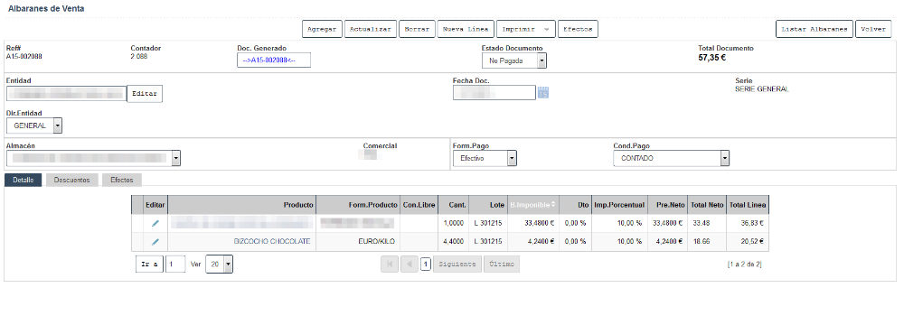
I'm trying to achieve something like this.
-
Attachments
-
- Selección_095.png (44.53 KiB) Viewed 3901 times
/Giuseppe
Professional Outsourcing Services
-
peebee
- AppGini Super Hero
- Posts: 356
- Joined: 2013-03-21 04:37
Post
by peebee » 2016-09-13 00:16
Your screenshot looks as though you may not be using the full width 12 grid columns that Bootstrap provides, although it is very difficult to say without inspecting the actual code. No live version available to take a quick look?.
Not sure how familiar you are with Bootstrap but it works on a grid of 12 columns and if you are only using say 2 x grids of 4 columns in any container/row (eg: 2 x grids of col-xs-4), that only adds up to 8 x columns, meaning the last 4 x columns (or 1/3 of the grid) on the right are empty. 2 x grids of 6 columns (eg: 2 x of col-xs-6) would go full width across the 12 x columns, so would 3 x grids of 4 columns, 4 x grids of 3 x columns, etc..... Hope that makes sense?
Here's info about Bootstrap grid:
http://getbootstrap.com/css/#grid I'm sure they will explain it a lot better.
-
DevGiu
- AppGini Super Hero
- Posts: 151
- Joined: 2016-05-27 09:08
Post
by DevGiu » 2016-09-13 12:06
peebee wrote:Your screenshot looks as though you may not be using the full width 12 grid columns that Bootstrap provides, although it is very difficult to say without inspecting the actual code. No live version available to take a quick look?.
Not sure how familiar you are with Bootstrap but it works on a grid of 12 columns and if you are only using say 2 x grids of 4 columns in any container/row (eg: 2 x grids of col-xs-4), that only adds up to 8 x columns, meaning the last 4 x columns (or 1/3 of the grid) on the right are empty. 2 x grids of 6 columns (eg: 2 x of col-xs-6) would go full width across the 12 x columns, so would 3 x grids of 4 columns, 4 x grids of 3 x columns, etc..... Hope that makes sense?
Here's info about Bootstrap grid:
http://getbootstrap.com/css/#grid I'm sure they will explain it a lot better.
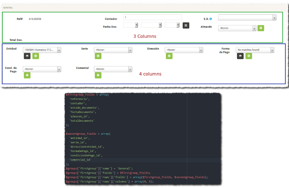
Thanks, playing with it, showing progress, but not sure yet why in the first group, is missing in second line the first position. there is nothing there.
- groupos.png (131.75 KiB) Viewed 3889 times
/Giuseppe
Professional Outsourcing Services